Breaking down realignment, assessing other possibilities

As you’re probably aware, the NHL recently made an offer for realignment…an offer the Board of Governors can’t refuse.
Well, they can, but they would have to deal with 700,000 hockey fans wielding pitchforks crafted from the never-melting snow of Winnipeg.
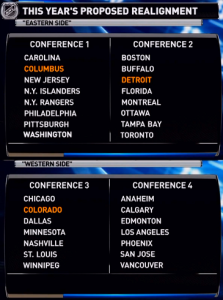
The latest proposal features four divisions and two “conferences”: two seven-team divisions in the West and two eight-team divisions in the East. Most notably, the Winnipeg Jets finally gets out of their Southeast Division hole and move to an appropriate division in the center of the continent. If approved, the changes would take place next season and would be reevaluated the season after that. Here’s a screenshot of the proposed divisions:
The first issue one probably notices is the fact that one conference has 16 teams with two eight-team divisions while the other has 14 teams with two seven-team division. In the proposed realignment, the top three teams from each division make the playoffs, and there would be two “wild card” spots for the next best two teams from the conference (eight from each). Mathematically speaking, it’s more difficult to reach the playoffs in the Eastern Conference than in the Western Conference. As opposed to 53.3 percent of teams making the playoffs in each conference, now 50 percent of teams make the playoffs in the East, and about 57 percent of teams in the West make the playoffs. The seven percent might not seem that significant, but don’t these numbers seem familiar? I remember hearing 50 percent and 57 percent a lot during some event in the offseason…can’t quite remember what that is though.
In a sport where just making the playoffs is everything, we can’t afford to deny teams potential playoff spots because they have an extra team in their conference. What if realignment was done last year and instead of putting 16 teams in the East, 16 teams were put in the West? It’s entirely possible the Los Angeles Kings would’ve missed the playoffs entirely, thus denying them a Stanley Cup. It’s a hypothetical that doesn’t make practical sense, but the same situation could happen in the East under new realignment. Despite Stephen A. Smith’s flamboyant, nonsensical mouth noises, there’s an incredible amount of parity in the league and any team that makes the playoffs has a legitimate chance to win it all, and we can’t take away that opportunity because a team from the 14-team conference has a better opportunity.
There are also some scheduling issues. In the proposed schedule, each team plays teams in the other conference twice (a home and away game) and teams in the other division three times (amount of home and away games would rotate each season, I presume). But since the conferences are uneven, they had to get a bit creative and confusing for the interdivisional games. The West plays five interdivisional opponents five times and one team four times, while the East plays interdivisional opponents either four or five times on a rotating basis. It seems a bit odd to have different schedules for each conference. Although, fans would probably enjoy two games against teams in the other conference every year.
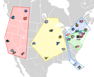
Now let’s take a look at some the positives, starting with the one that comprised the crux of the realignment issue: Winnipeg finally sees some justice, as they no longer have to play in the Southeast Division (of the United States) despite being in central Canada. Also, Detroit and Columbus move to their appropriate conference, since both cities use Eastern Standard Time (EST). Heck, you could call the new “Eastern Conference” the “Eastern Standard Time Zone Conference.” But the changes bring imperfections. The two Florida teams are being added to the teams that currently comprise the Northeast Division, giving them an unfavorable travel schedule that looks even more awkward when mapped out.
As you can see, teams in “Division 2” actually have to travel through “Division 1” to get to/from Florida.
Now on to the two-division system (in each conference). No more cheap division winners. Last year, the Southeast was so bad that the division winner, the Florida Panthers, barely had enough points to make the playoffs; they would have gotten the sixth seed instead of the third and had only two more points than the #7 and #8 teams, and it’s very possible that a similar situation happens this year. Under the current system, it’s possible that a team in an awful conference place below the top-eight in the conference in terms of points, yet get a high seed (let alone actually making the postseason) with home-ice advantage while a team that would have otherwise made it has to hit the golf course early. That doesn’t seem very fair.
As far as maintaining rivalries, the proposed realignment does a solid job, with the only real blemish being that Chicago and Detroit would be in different conferences, although Detroit and Toronto can renew their rivalry. We’ll call that aspect a wash.
We also need to consider another reason behind the uneven rearrangement: the league might plan to expand in the next few years to 32 teams, meaning we could have four EVEN eight-team divisions. Makes sense. BUT, that might create the need for ANOTHER realignment, especially if one of those teams is one of the likely destinations in Hamilton, Quebec, or Toronto, since there are already 16 teams in the East. And what if a team like Phoenix or Florida relocates? Has the league considered that? It might make more sense to put 16 teams in the West if they’re going down that road, even if it screws up time zones and travel schedules for some teams.
So the proposal solves a few problems but also raises a few. What else could they do?
The league could have simply moved swapped Nashville and Winnipeg, moving Winnipeg to its respective time zone in the Central Division and, while moving Nashville to the incorrect time zone (EST when it should be Central Standard Time), creating a fair travel schedule for them. But what about Detroit and Columbus? As mentioned, they aren’t in the correct conference in terms of time zones and travel. As the extreme majority of fans of both teams live in Eastern Time Zone, games played on the West Coast don’t start until 10:00 p.m. their time. Not everyone can stay up to 12:30 or 1:00. How is a fanbase like Columbus going to grow if they have to stay up past midnight just to watch their dismal team lose? Who’s going to invest that time and effort? It’s not fair to those fans, plus the actual teams that have harsher travel schedules.
The whole point of the new realignment is to make it at least reasonably fair for the Jets, who, let’s be honest, are getting screwed right now. So they can’t pick favorites by helping Winnipeg (and Nashville to an extent) but ignoring Detroit and Columbus.
So this four-division proposal makes sense for at least putting teams in their appropriate time zones (all teams in the Eastern Conference would be in EST), although there’s still the issue of making the Florida teams have harsher travel schedules, in addition to the problem of having uneven conferences as listed above.

(Bruce Bennett/Getty Images North America)
As the way the current teams stand, there’s no middle ground. A few teams are going to get the short end of the stuck and be unhappy. We can sit here and suggest alternate six-division alignments, different four-division alignments, 10 three-team divisions, or we could just hit the self-destruct button and create one giant conference for all 30 teams. I guess we’ll just keep revisiting the idea of realignment until it’s re-re-re-realignment.
OR. We could just go for it and make a few, ah, personnel changes.
I’m talking about moving Florida to Seattle. The Florida Panthers, that is.
Let’s be honest. The Panthers don’t draw very well (and you can’t go by listed attendance numbers since it counts tickets sold and given away instead of actual fans in attendance). Their fans know it, and the fans of every other team know it, which is probably why Florida’s BB&T Center is constantly filled with opposing teams’ jerseys. I understand wanting to have teams in the South so the NHL spreads across the States, but the State of Florida already has two teams, and the Panthers’ state rivals, the Tampa Bay Lightning, do quite well. Does Sunrise, Florida, really need a hockey team?
Now let’s talk about Seattle. It’s a nice city with a great sports market. They already have a WHL team in the Seattle Thunderbirds. The Seattle Seahawks (NFL) are renowned for having the loudest building in the league, and the results show on the team’s home records. The Mariners (MLB), uh, exist. And they used to have a rabid NBA fanbase with the Seattle Supersonics until the team was [unjustly] taken away in 2008, but the fans’ passion helped form an NBA return to Seattle that will happen in the next few years. And with that new NBA team comes a new arena. An arena equally suitable for hockey.
So let’s forget about the fact that they would almost indefinitely draw more fans than Florida, and therefore would generate more revenue, from which the entire league benefits. With a Florida move to Seattle, each conference has an even 15 teams, each of which is in the conference and division it should be, and we can go back to the six-division, two-conference league we have today. It’s a fair idea that shouldn’t be dismissed.
For now, the proposed realignment works, and it’s really something that has to get done so the incessant shafting of one individual team, the Winnipeg Jets, finally comes to an end, and the team has a reasonable shot at winning. And then we just have to pray that another relocation doesn’t cause re-realignment, making us debate the issue again and again.


