Who:
Anaheim Ducks
Where: Honda Center, Anaheim, CA
When: 10:00PM
Know thine enemy: There might not be anyone playing better than the Ducks right now, winners of their last six. Corey Perry and Ryan Getzlaf continue to lead the way for the quack attack, tied for the league-lead in points with 10 each while Perry is tied for the league-lead in goals with eight. He’s coming of off his second hat-trick of the season against the Buffalo Sabres and shows no signs of slowing down.
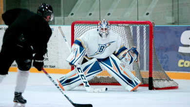
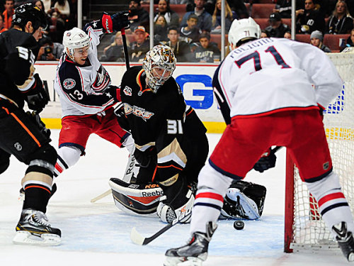
In net, Frederik Andersen has quickly gotten a stranglehold on the starting job, taking over for John Gibson in game two this year and never looking back: he’s 6-0-0 with a sparkling 1.32 goals against average and .951 save percentage. He’s allowed just eight goals in his six starts and he’s also the second goalie in NHL history to win 25 of his first 30 starts. He’s pretty good is the point.
The Ducks are third in the league in goals per game right now and tied for seventh in goals against. They have a pair of special teams units in the top dozen in the league. Everything is going right for them right now and they’re rolling along. This is going to be a test for the Blue Jackets on every level.
About the Blue Jackets: Resiliency has been the name of the game for the Jackets so far this season and last night’s win in San Jose is no different. For the third time this year (at least), the Jackets fell into a 2-0 hole early and climbed out of it with relative ease. Ryan Johansen continues to play like a man possessed and Columbus walked out of the Shark tank with a last second win.
In the face of all the adversity this season, the Jackets are playing well. They’re aggressive and physical and the pucks are hitting the back of the net. Johansen and Foligno are off to career-best starts and even though newbie Scott Hartnell doesn’t have a goal, he does have eight assists so far. So everyone is doing their part early on and the Jackets will need that kind of effort to beat the red-hot Ducks.
The part where I predict things: The Jackets are a frenetic team and they need to get off to a much better start than they have of late. Getting behind against a team like the Ducks could spell doom early if they’re not careful.
I’m not sure if Andersen will get his seventh straight start, but if he does, they’re going to have to put in work to get more than a couple past him. Defensively, the key is to stay on the Ducks and get physical with them. Perry and the like can be taken off their games and forced into a mucky, dirty contest.
Score: 3-2 Ducks
Latest posts by Ryan Womeldorf (see all)
- Three Things: Blue Jackets vs Florida Panthers 12/5/14 - December 5, 2014
- Columbus Blue Jackets Preview vs Florida Panthers 12/4/12 - December 4, 2014
- Throwback Thursday: How the Habs landed Jean Beliveau - December 4, 2014