FeaturedHighlight VideosOttawa Senators
How The Ottawa Senators Can Make The Playoffs (Game #76 – 03/31/15)
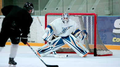
Down but not out.
Jordan Mady
Facebook: http://facebook.com/TheJordanMady
Twitter: http://twitter.com/TheJordanMady
Hocked on Hockey Magazine®
Website: http://hookedonhockeymagazine.com
Facebook: http://www.facebook.com/HOHMagazine
Twitter: https://twitter.com/HOH_MAGAZINE
Pinterest: http://www.pinterest.com/hookedonhockey
Instagram: http://instagram.com/hookedonhockeymagazine
G+: https://plus.google.com/+Hookedonhockeymagazine
Jordan Mady grew up playing hockey and is now aiming to make a career alongside it through writing. He is currently a journalism student at Ryerson University in Toronto. Jordan is also a video blogger and author.
Latest posts by Jordan Mady (see all)
- Ottawa Senators forward Bobby Ryan showing play-maker tendencies - December 9, 2015
- Ottawa Senators Trending In Right Direction With Tough Schedule Ahead - December 3, 2015
- The Craig Anderson Save That Defines Ottawa’s Season - November 28, 2015