Top 12 Dallas Stars Fights

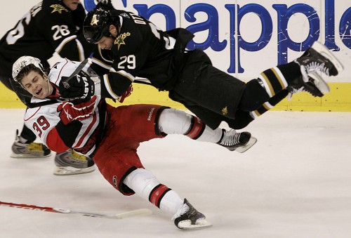
Throughout the history of the Dallas Stars, the franchise has had many tough players that could hold their own in a fight or at least talk their way into them quite easily. Now, I’m not going to point any fingers to any specific players, but some of the most Ott-some fights can be credited to one guy in some way or another.
12. The Eagle Soars Into Action
To kick off the list I just wanted to throw this in to showcase the fire and intensity of Eddie “The Eagle” Belfour. Even as a goaltender Ed managed to do some trash talking and occasionally have a scrap here and there.
11. Langenbrunner Drops The Gloves After Leveling An Opponent
This one makes the list for two reasons: First is the huge hit Langenbrunner lays on an Oilers player, and second is just how electric the fans at the American Airlines Center were after the fight. It also helps that Langenbrunner is one of my personal favorites. Kurtis Foster may not be able to fight, but props to him for standing up for a teammate.
10. Luddy Uses Glenn Anderson As A Ragdoll
Good ‘ol Craig Ludwig was pretty good when it came to blocking shots as well as the fisticuffs. Here’s an example of the latter.
9. Morrow Fights… On One Leg
Brenden Morrow has had his fair share of fights, but there is probably none more memorable than when he tried to fight Alexandre Burrows of the Vancouver Canucks. While I wouldn’t call it a full blown fight, Brenden Morrow didn’t even let the fact that he couldn’t use his left leg stop him.
8. Jamie Benn Takes on Joe Thornton And Looks Good Doing It
Next up on the list is when the youngster Jamie Been dropped the gloves and had a little dance with the seasoned vet Joe Thornton. Most notable is not only Benn’s intensity during the fight, but also the fact that he is constantly throwing out hair flips between punches, something that probably cost him the fight. It’s no surprise he came back this season with a freshly trimmed flow that won’t get in the way next time.
7. When Otters Attack
What kind of list would this be without having a few scraps from none other than Steve Ott?
6. Stars And Bruins Pull An Oprah Winfrey With Fights
YOU GET A FIGHT! YOU GET A FIGHT! EVERYONE GETS A FIGHT!
5. Stars vs. Wild Line Brawl
When Reilly Smith was in trouble and being tag teamed by two Minnesota Wild goons, it’s no surprise that his teammates came to the rescue. Also no surprise is how ready Antoine Roussel was to drop the gloves, but something not expected was Jaromir Jagr getting in on the action. While he didn’t throw any punches, and quite frankly he got pretty roughed up, he’s still not a guy you normally get to see involved in a scrap like this.
4. Hey Hatch, Gimme A Piece Of That!
This makes the list for three reasons: First, the fact that the Stars happened to have Derian Hatcher, Claude Lemieux, Phillipe Boucher, and Steve Ott on the ice all at the time this happened. Second, the repeated right hands Derian Hatcher lays on Pavol Demitra (R.I.P.). And third, Jeff Finley of the St. Louis Blues attempting to drag Derian Hatcher into the penalty box so he can have a go at Hatch himself.
3. The Cap’n Drops The Gloves
Yet another fight from the Dallas Stars’ longest serving captain, Derian Hatcher.
2. Benner Cuts Iginla Open
Coming in at second is another fight from the youngster Jamie Benn. This time he takes on Jarome Igninla of the Calgary Flames, another seasoned veteran. While Benn doesn’t quite win the fight, he gives Iginla a bloody little souvenir to remember him by.
1. The Duel Of Legends
Coming in at number one is one of my favorites and yet again features Dallas Stars hero Derian Hatcher. This time he takes on the one and only Brendan Shanahan, a guy that would eventually become his teammate. Note that this was the 1998-99 season, so you could say that Hatcher got the last laugh when he lifted Lord Stanley’s Cup. Then again, you could say Shanahan has had a little luck when it comes to winning the Cup.
Well ladies and gentleman, that’s my list. Some may agree, some may not. You’re welcome to make your own, but keep in mind all other list will be forced to do a tango with Sean Avery…. On Dancing With the Stars, that is.

